Impasto Pizza: Branding & Menu Design

Ciao!
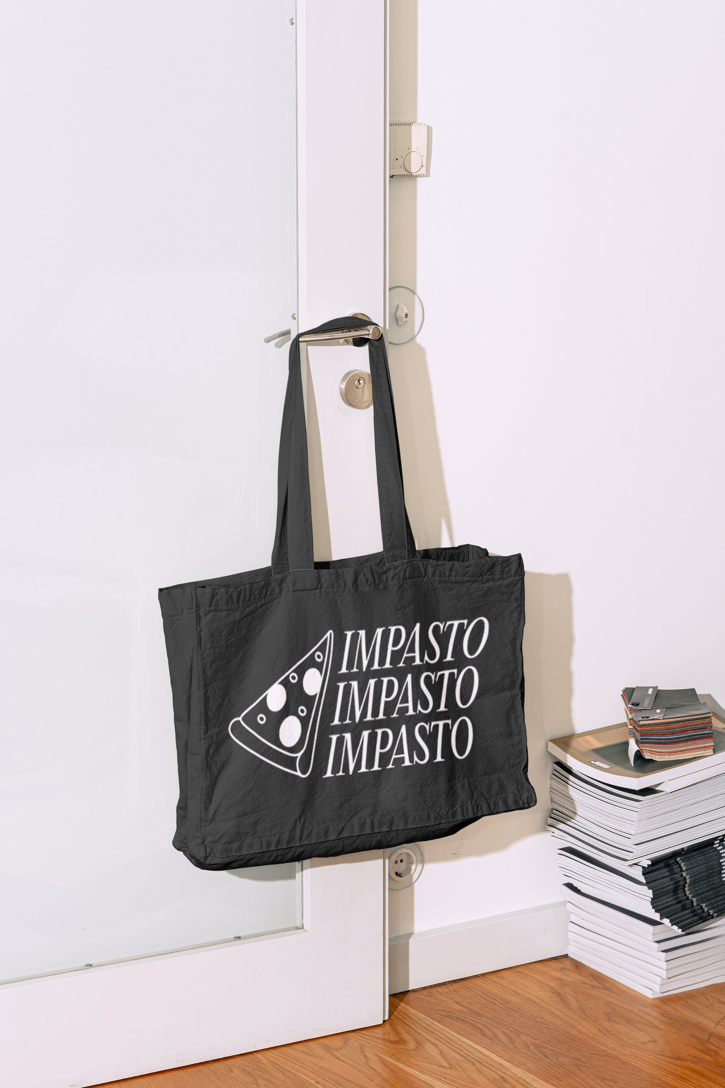
Deliverables: Brand identity, Menu, Pizza Boxes, Merchandise Designs, Tableware, Signage
Impasto, meaning “Dough” in Italian, is a pizza restaurant bringing the essence of Roman street food to the heart of Adelaide. The restaurant’s signature item, ‘Pizza Al Taglio’ (Pizza by the Slice), offers a versatile option for those wanting a few slices rather than a whole pizza, ideal for quick lunches. This is reflected in the logo, featuring a playfully illustrated pizza slice paired with a classic typeface for the logotype. Bold shades of yellow, green, and red—echoing the Italian flag—evoke a sense of authenticity and warmth.
Positioned in a mid-to-upper price range, Impasto’s branding leans into tradition with playful touches, balancing elegance and charm. The menu design further enhances this experience with a simple yet engaging layout, combining classic typography and subtle illustrations that invite diners into the world of Italian street cuisine.
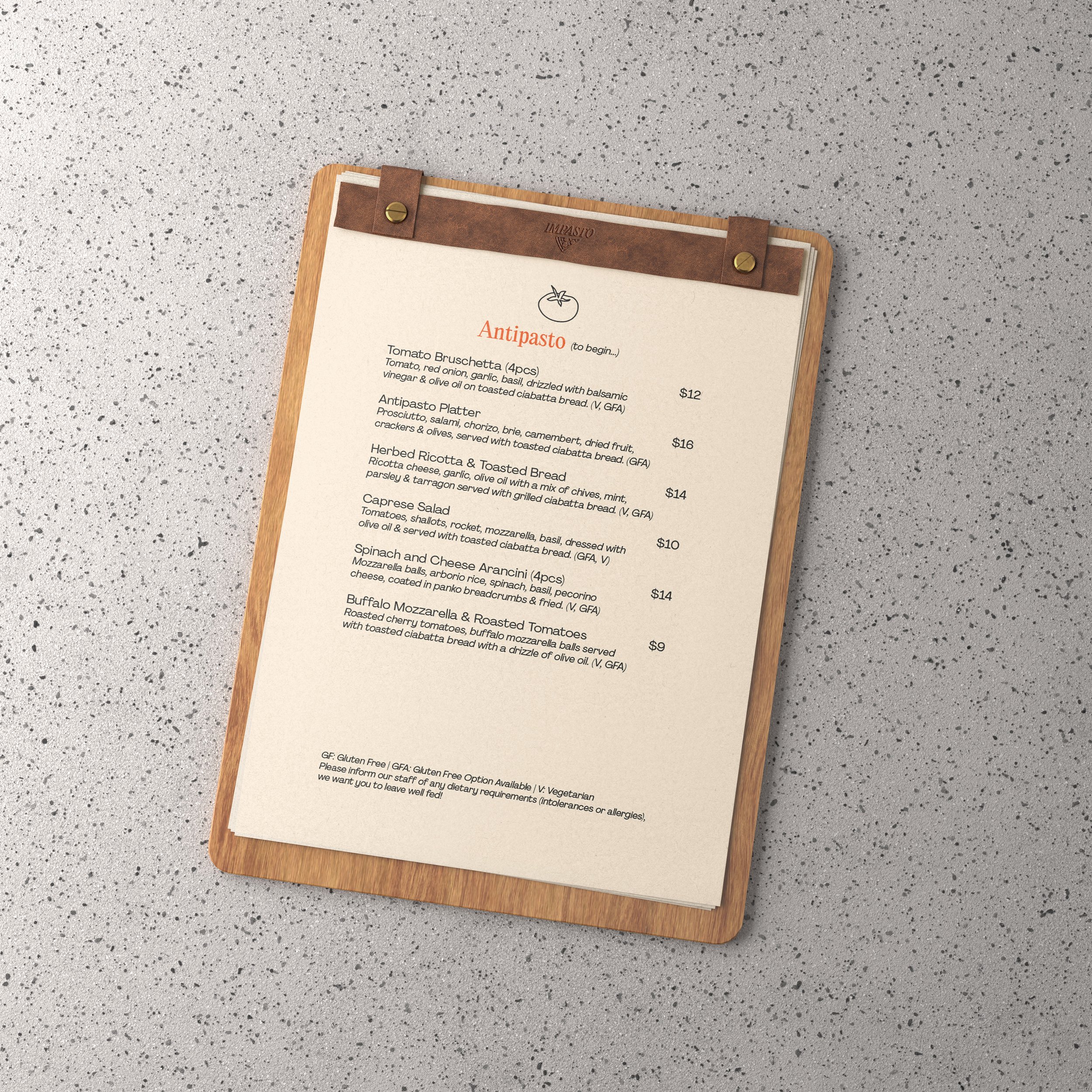
Additionally, the brand voice plays a vital role in creating a welcoming atmosphere, using Italian words as menu headings, with cheeky English translations beside them. These elements reinforce Impasto’s mission to provide an authentic, enjoyable experience for every customer, capturing the true spirit of Italian hospitality.