
Adelaide Botanic Gardens Rebrand
The rebrand of the Botanic Gardens of South Australia was driven by a need to modernize its image while staying true to its historical roots. The primary objective was to create a brand that invites a broader demographic, engaging visitors of all ages. While the gardens are frequented by older adults, school groups, and families, there is a notable absence of younger adults and teenagers, particularly during quieter periods.
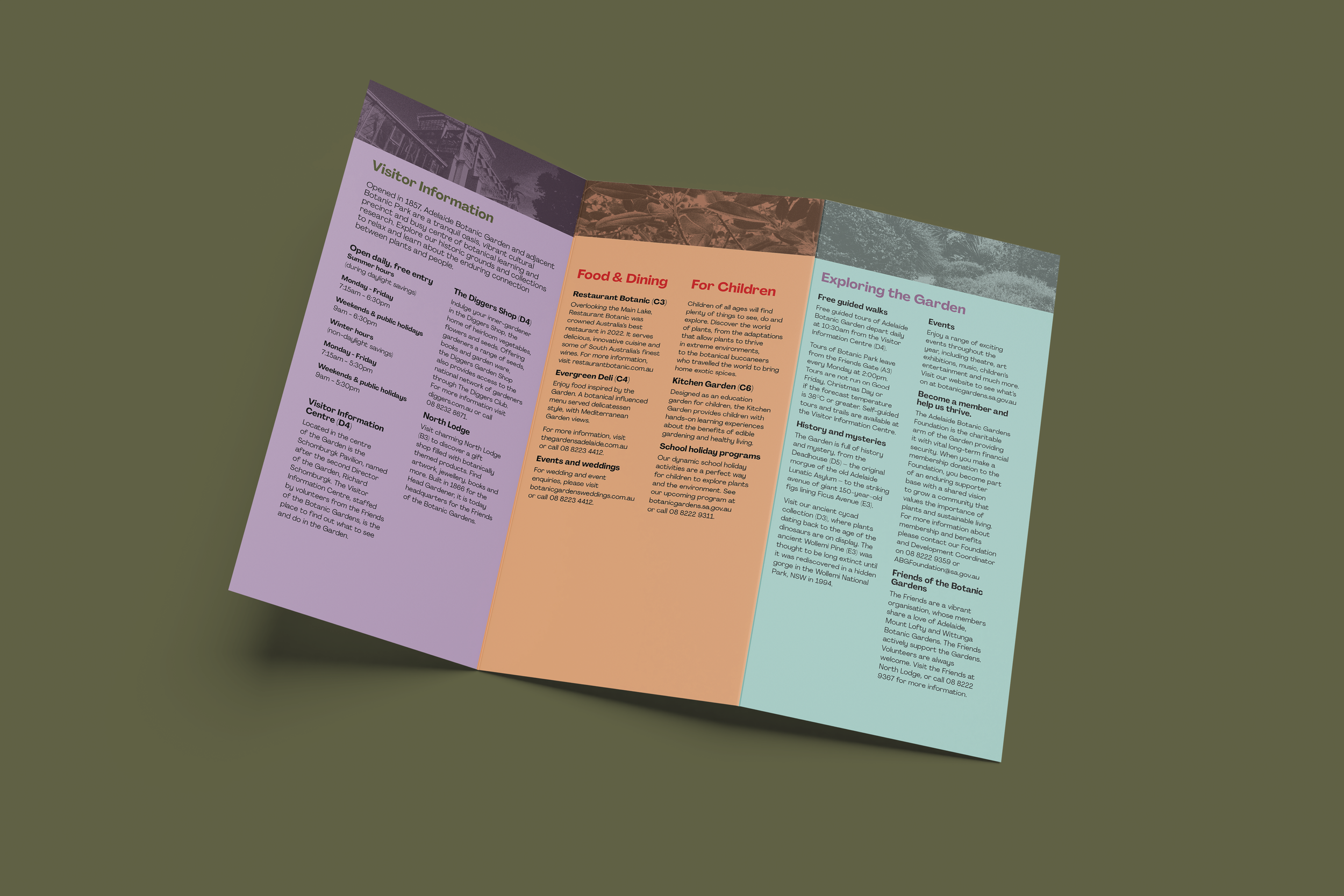
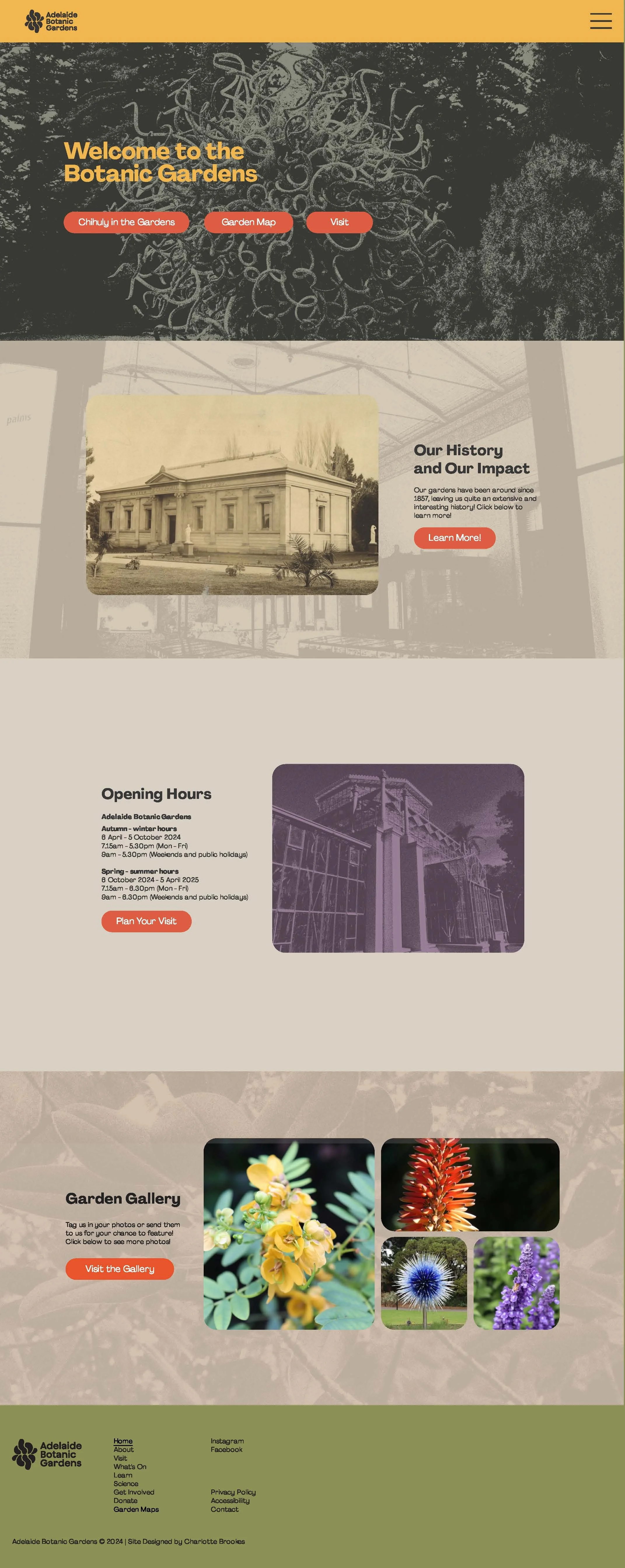
The previous branding felt outdated, creating the perfect opportunity to refresh the identity with a vibrant and contemporary approach. The new brand introduces a dynamic colour palette, injecting energy and warmth to encourage wider appeal and audience engagement.
A key element in the rebranding was the incorporation of the garden’s history, represented through a mark inspired by the garden’s iconic pathways. This subtle nod to the past ensures that the redesign resonates with long-time visitors while drawing in new audiences. The use of vibrant colors, combined with the risograph textures in the imagery, creates a visually engaging brand identity that breathes fresh life into the once tired botanic gardens.
Overall, the rebrand balances tradition with modernity, creating a welcoming and inclusive feel that will help attract diverse group of visitors and breathe new life into the gardens.