Clarion Spirits: Non-Alcoholic Beverage Brand

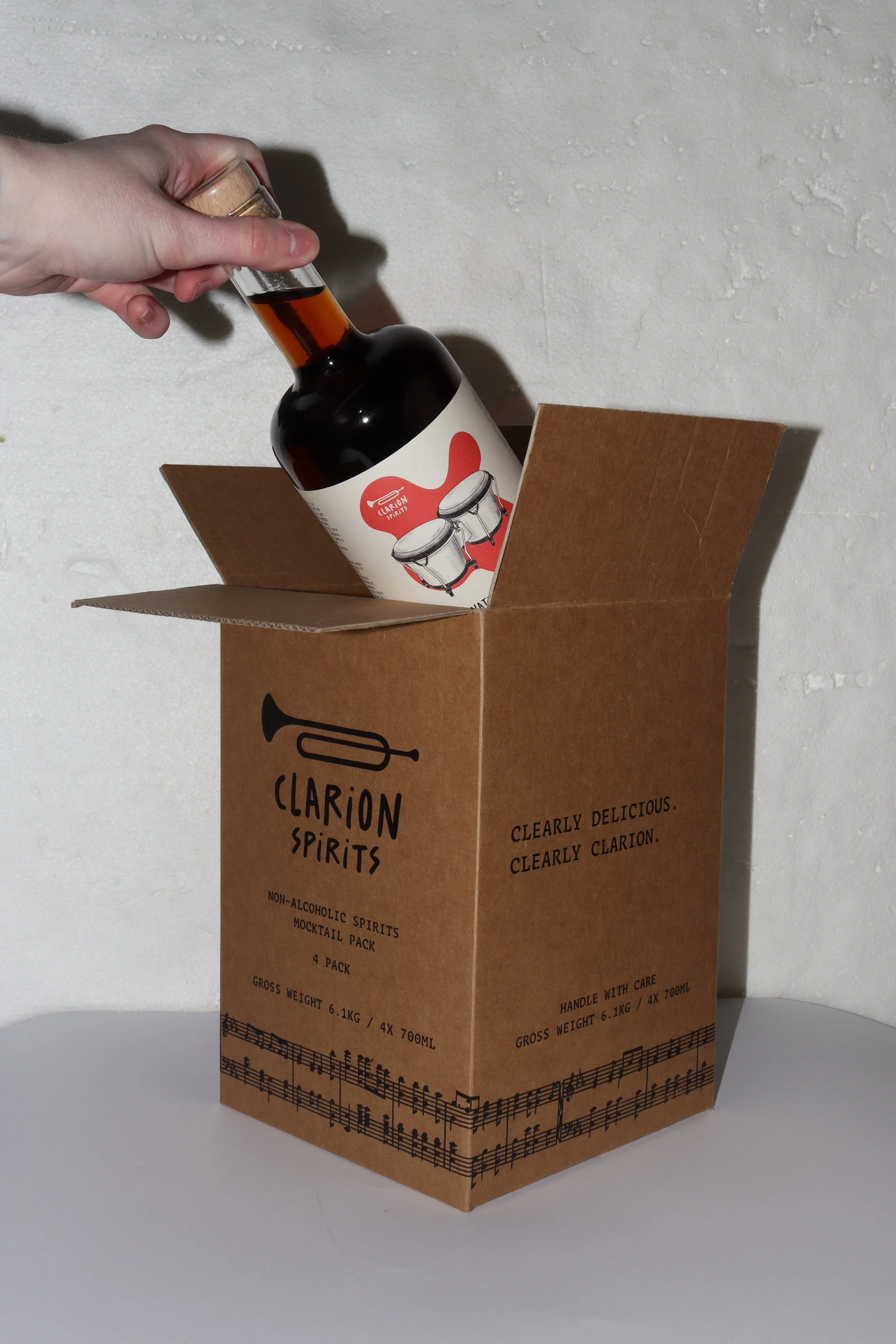
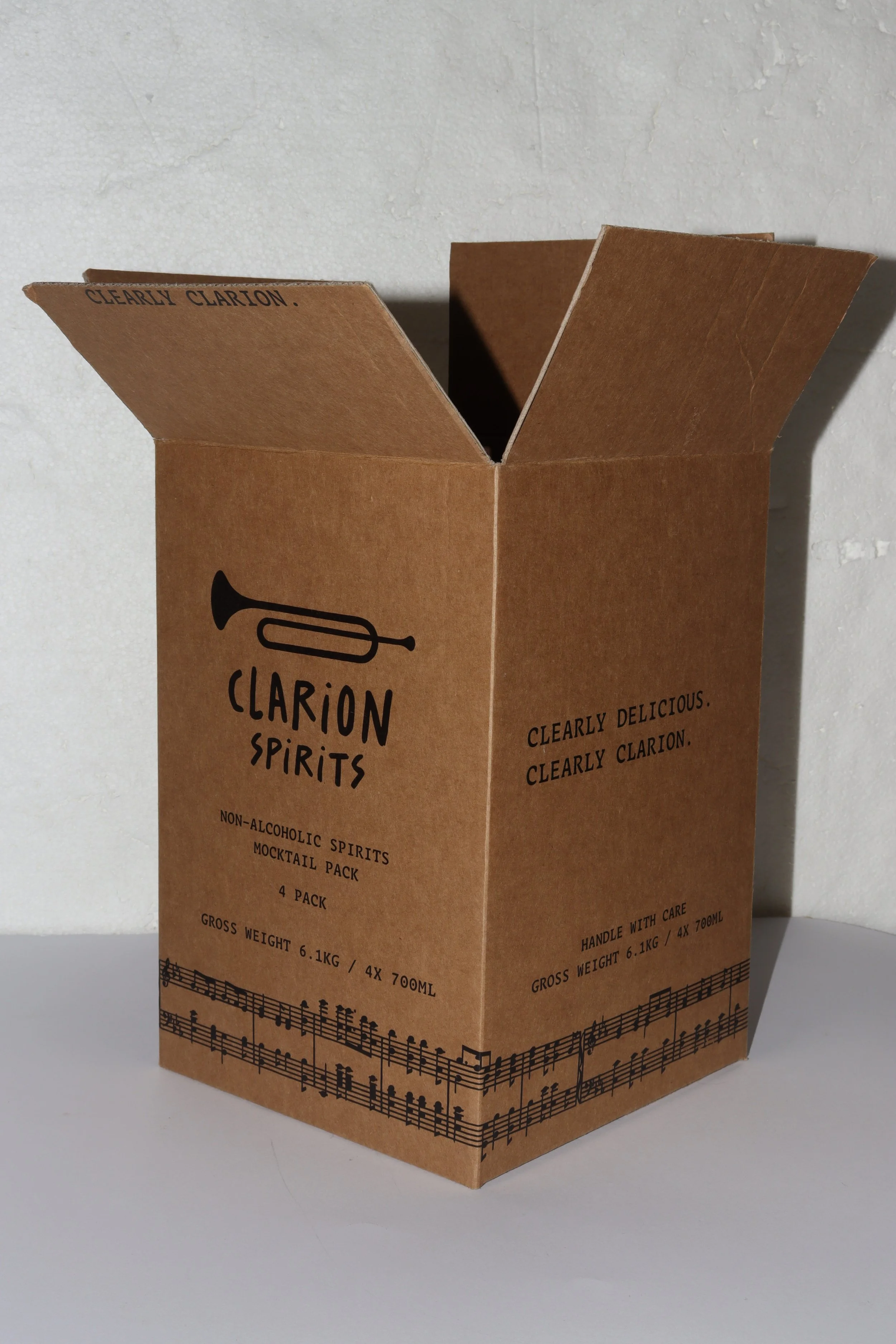
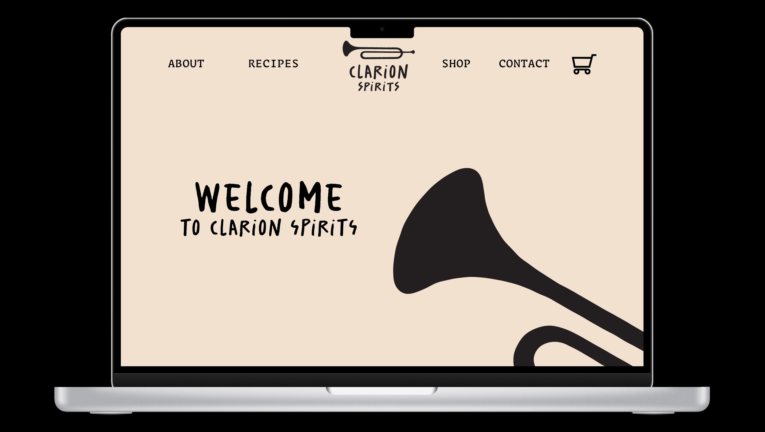
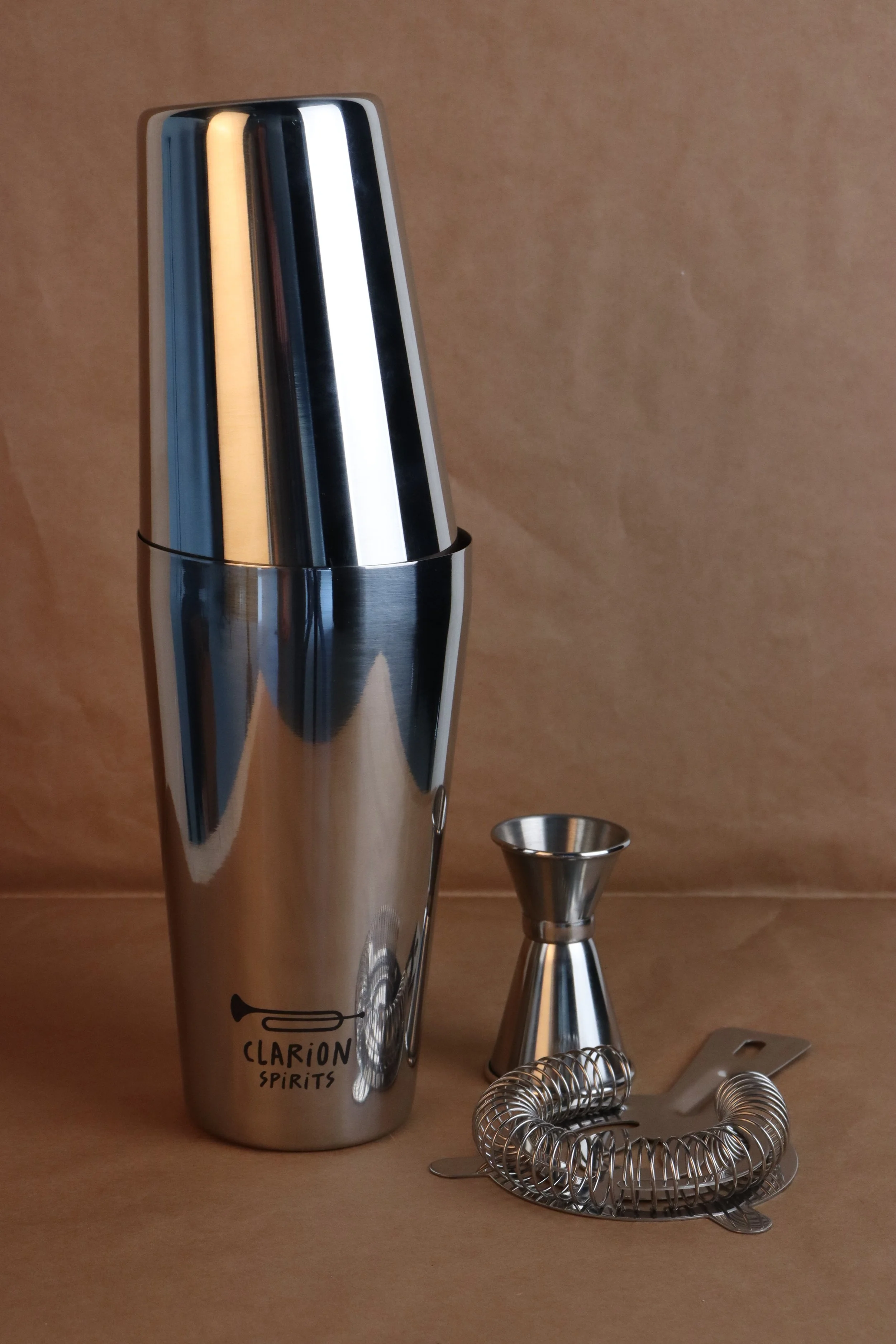
Deliverables: Brand, Labels, Bottles, Packaging for Bottles, Large Scale Advertisement, Social Media Tiles, Promotional Merchandise, Website.
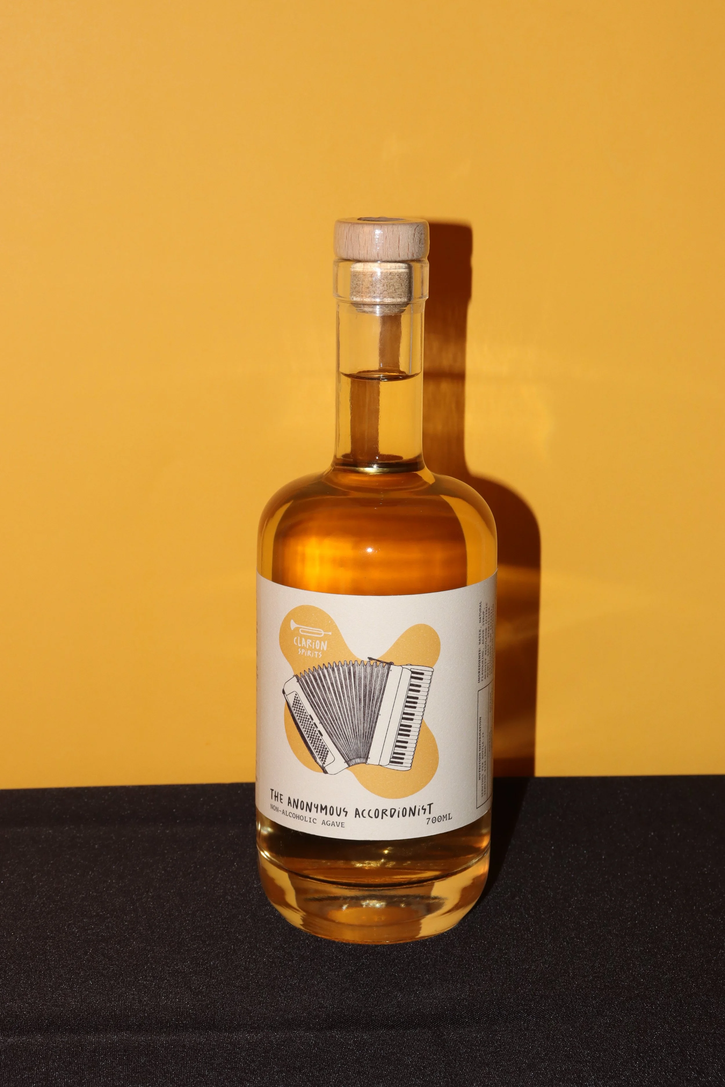
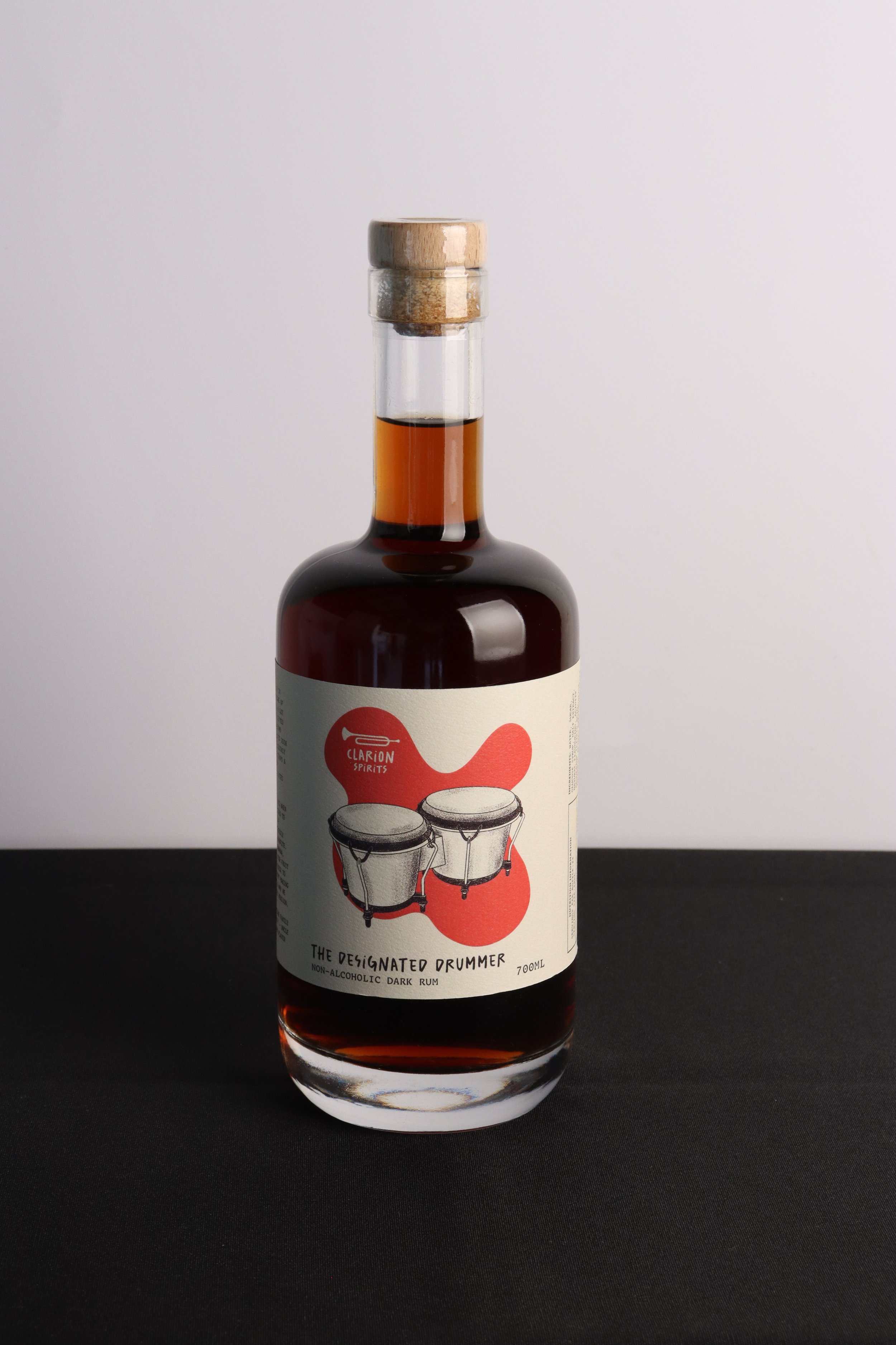
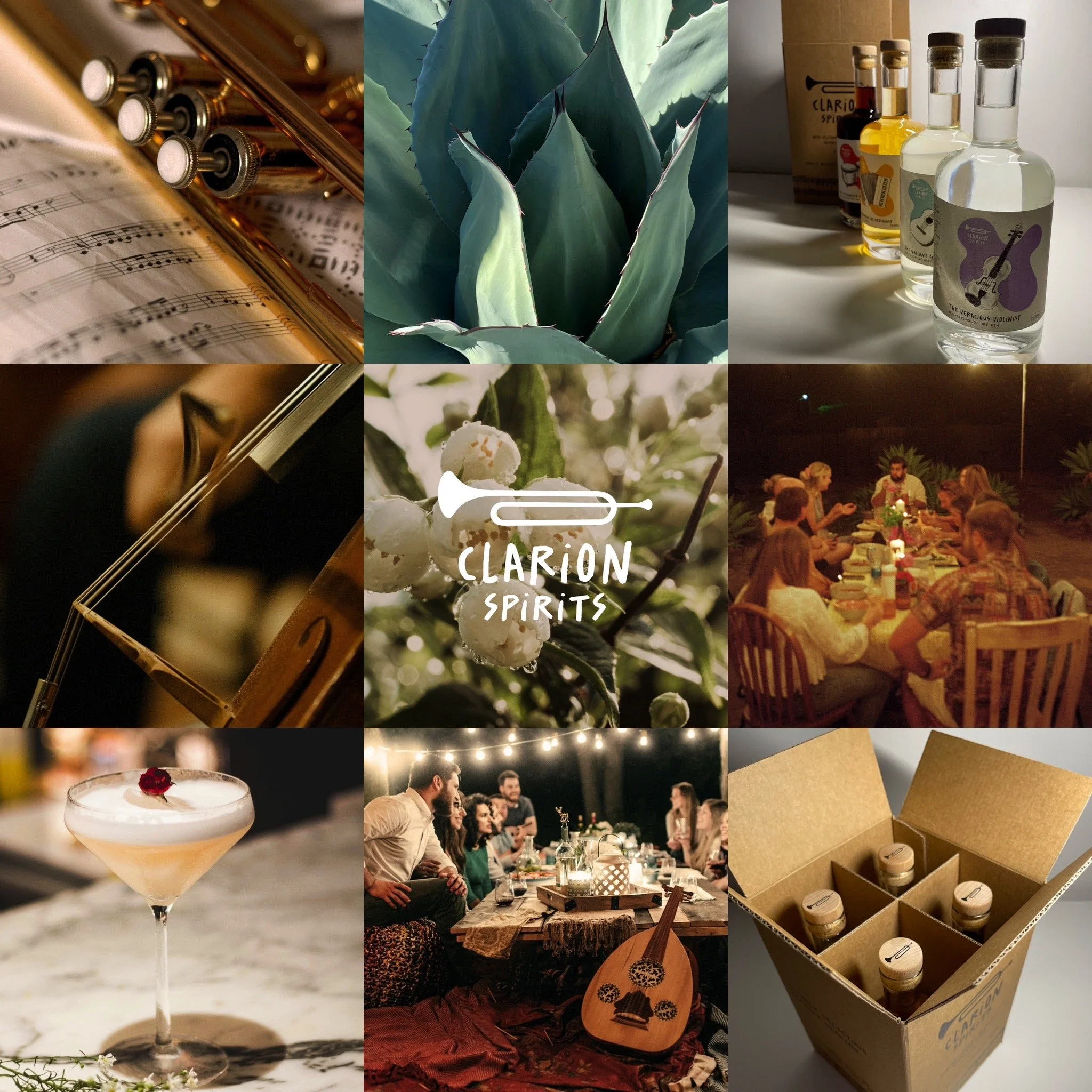
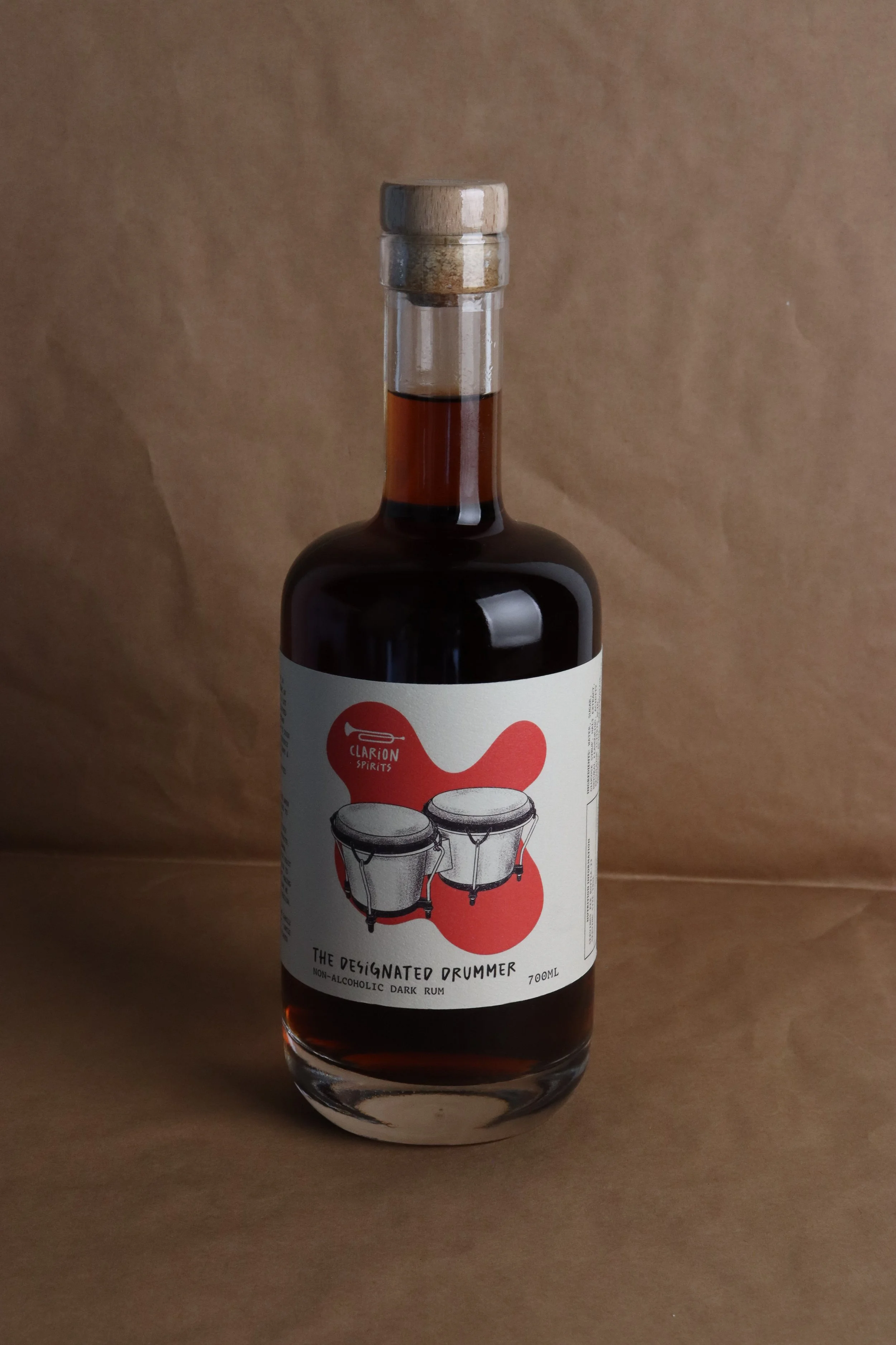
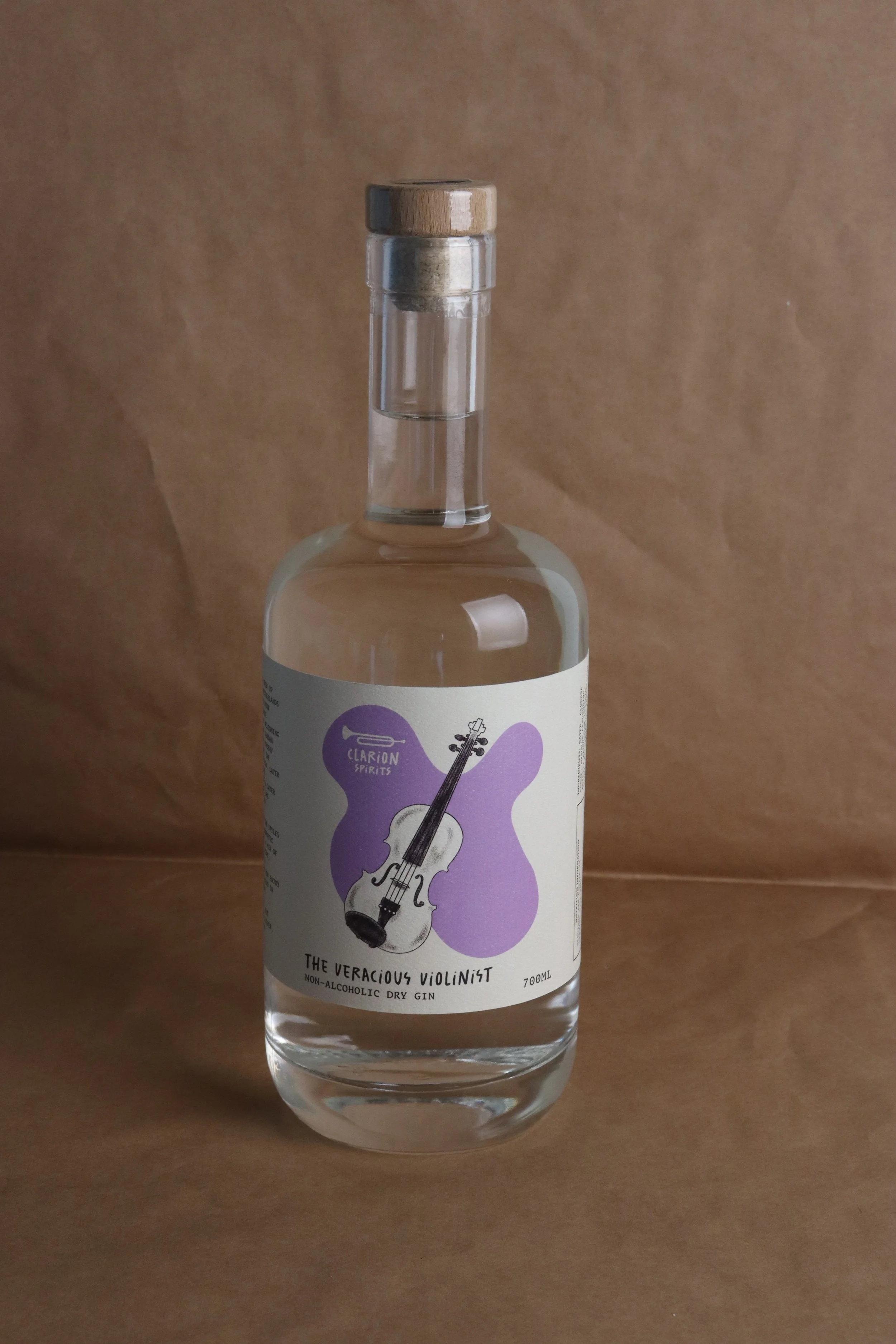
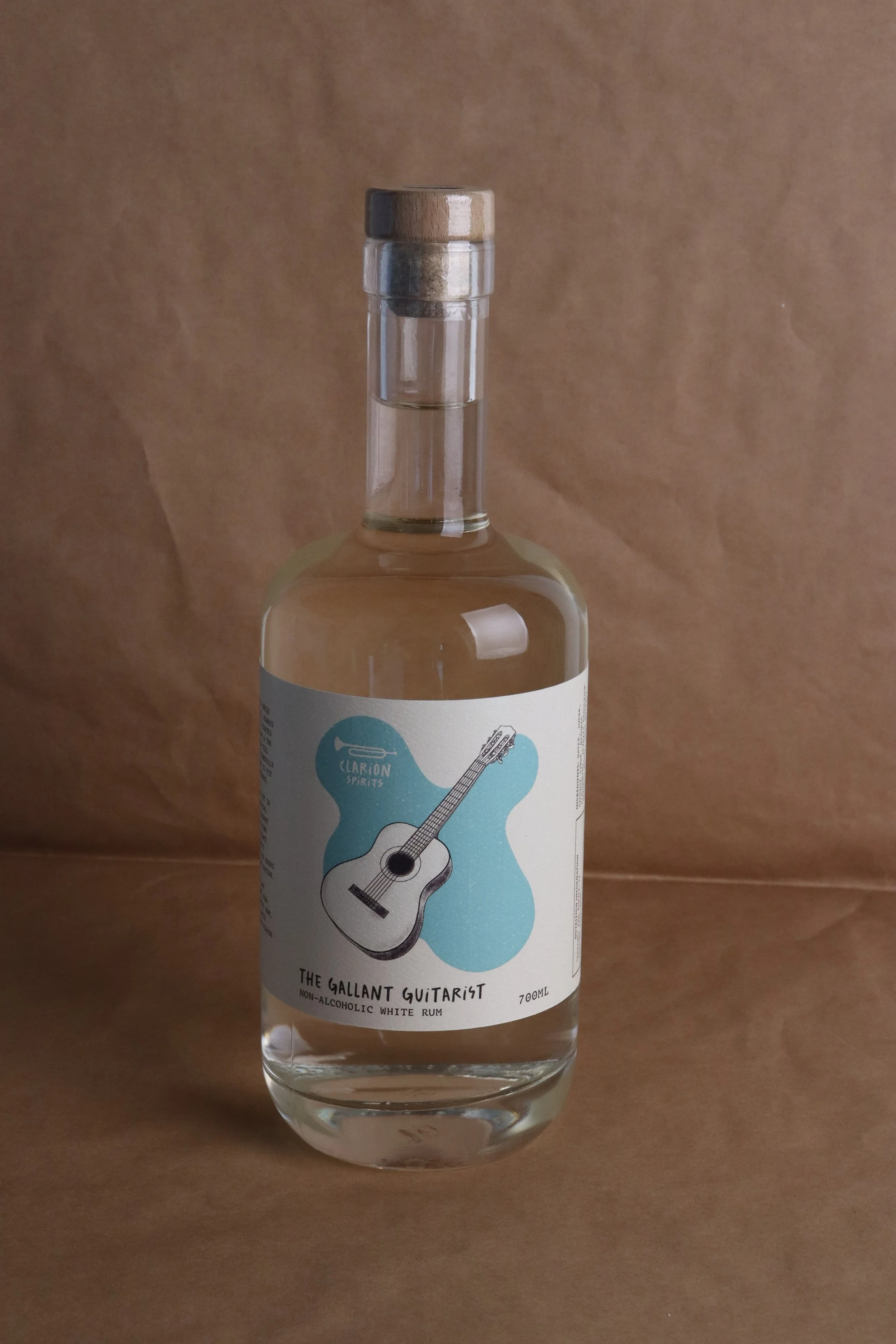
Clarion Spirits is a reflection of family, music and culture. The brand is inspired by founder, Hazel’s uncle Oliver, a Clarion player, who became diabetic and had to put drinking behind him. They both come from a family of musicians who would distill their own spirits and exchange them at family gatherings, making for lots of fun and musical nights. Hazel and her father, determined to keep Oliver from missing out, created variations of their family member’s spirits, but in non-alcoholic form.
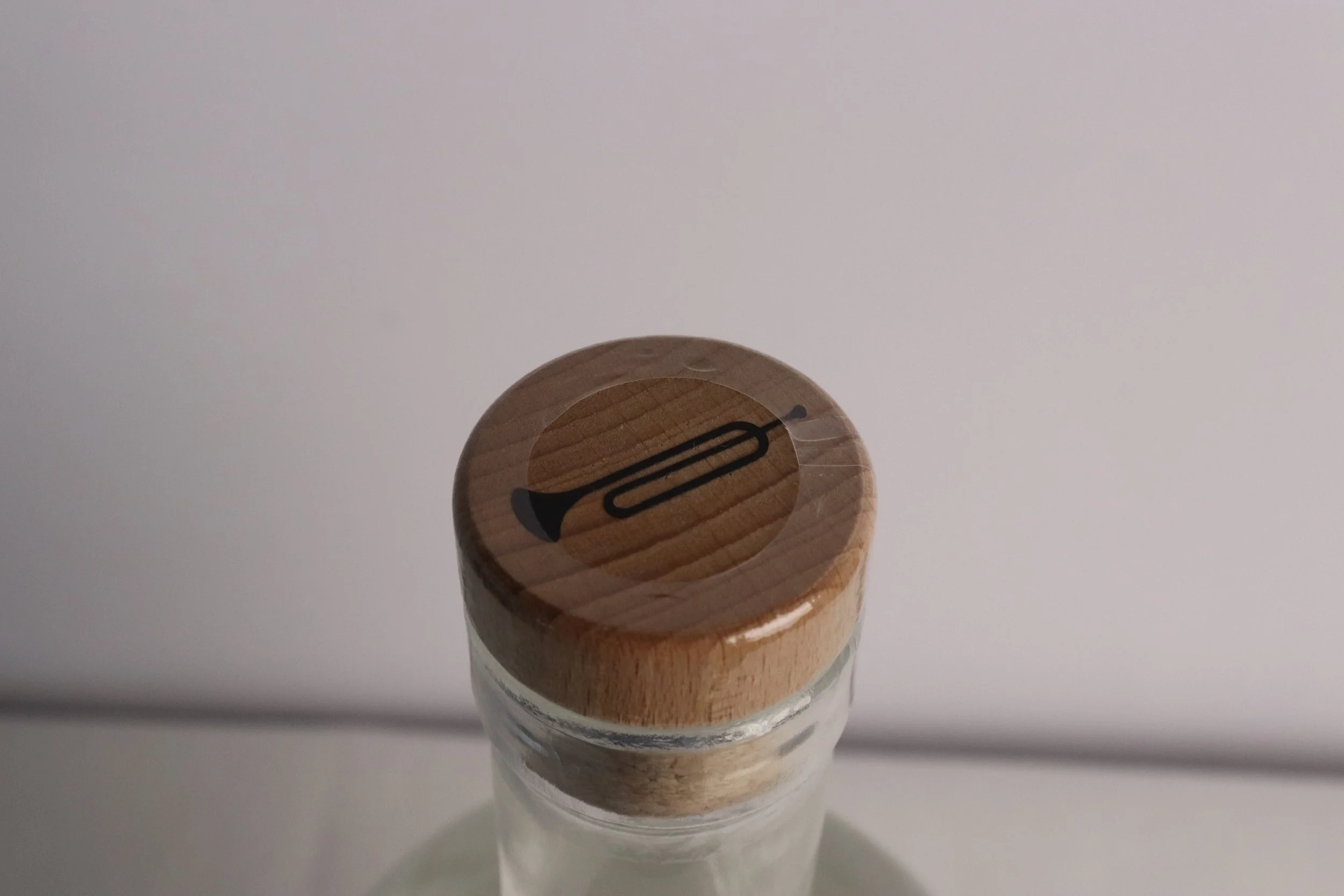
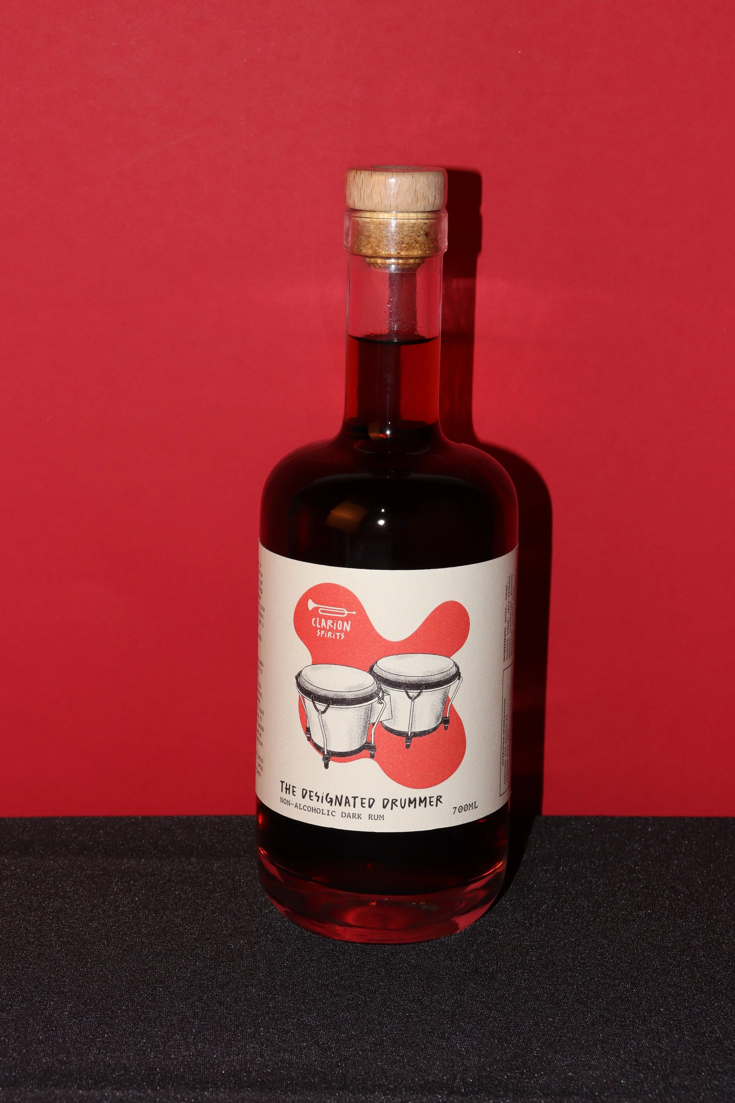
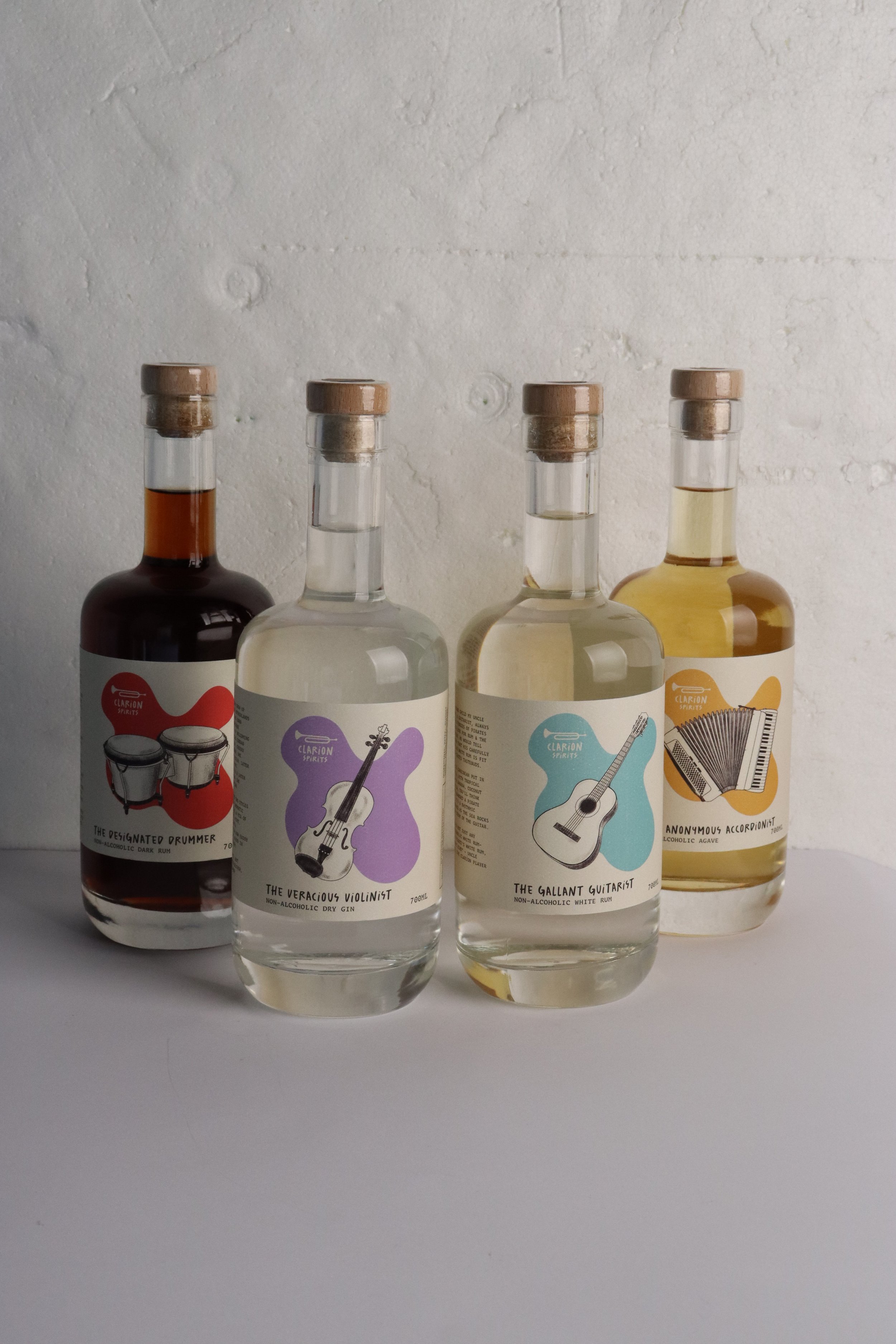
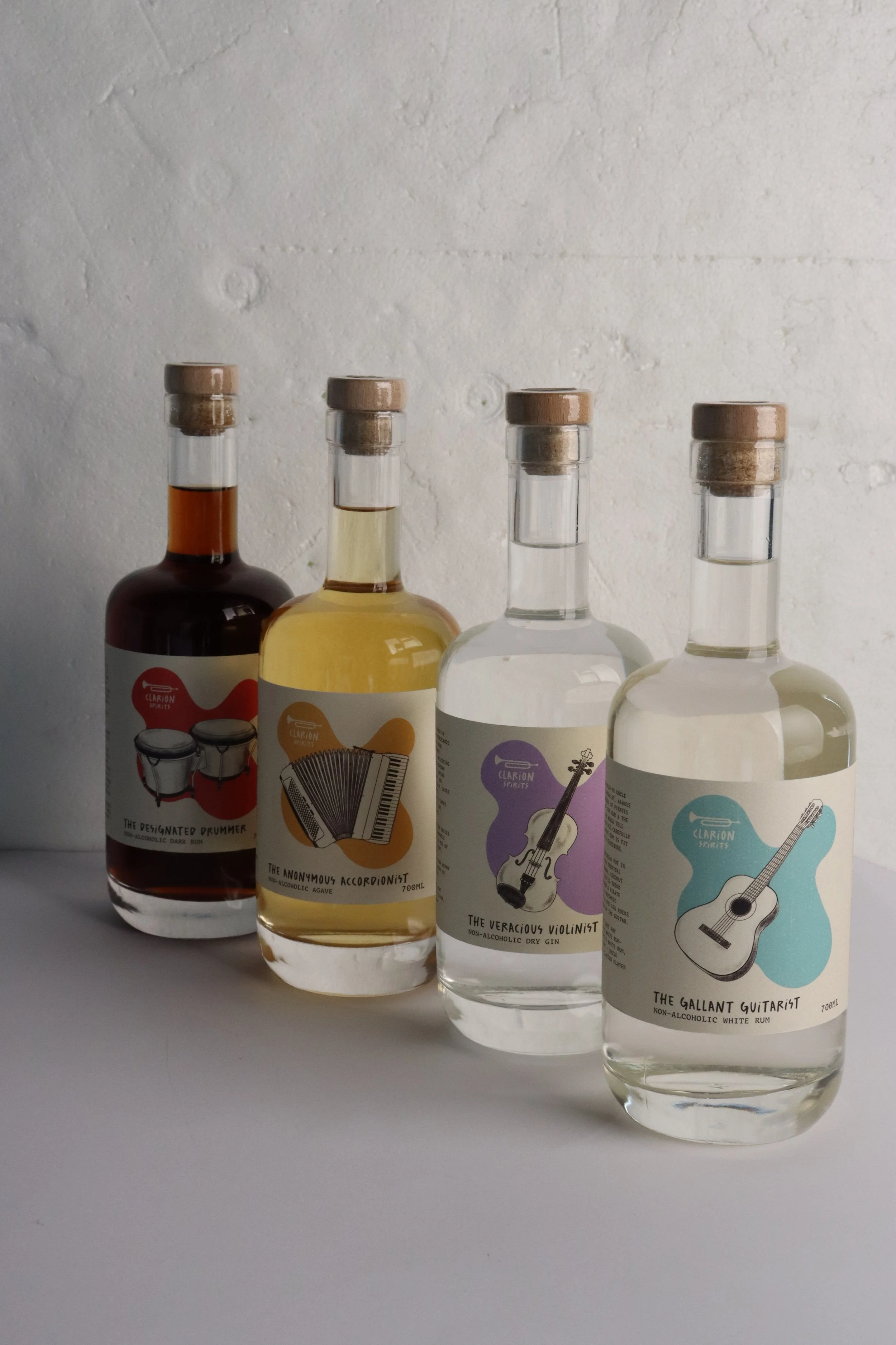
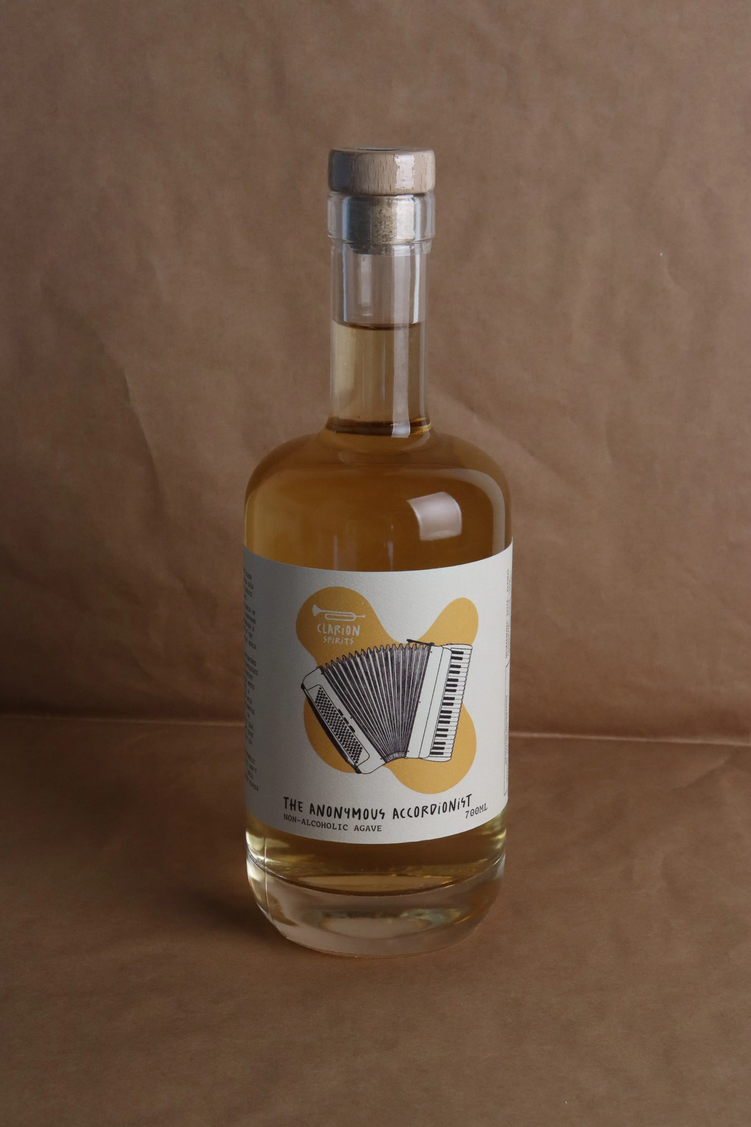
With Clarion both being a type of trumpet, and meaning ‘loud and clear’, the logo and name suit the brand perfectly. Each bottle is inspired by a family member, the instrument they play (hand illustrated) & the type of spirit they distill. The names of each bottle aim to poke a bit of fun at the non-drinker stereotypes, “The Anonymous Accordionist” and “The Designated Drummer”, the others take on descriptors of some common personality traits of nondrinkers - “The Veracious Violinist” and “The Gallant Guitarist”.
Clarion conveys a feeling of invitation and warmth, anyone is welcome to join the party and have a drink. Using a range of colours to distinguish each variety and a warm but light yellow background, the bottles stand out well from their competitors, making for an inviting brand image. The warmth extends to the social media, website and other assets, with a welcoming colour palette.